In May, the Tableau Conference kicked off in Las Vegas, Nevada, with more than 5,000 participants. Attendees varied between developers, client users, and system architects partaking in more than 200 sessions with topics ranging from beginner to advanced, and technical use to client interactions. The overall tone of the conference was that data is for everyone, not just “data people.” Tableau—and dashboards more broadly—provides an avenue for users to navigate and consume their data in a more approachable way. Tableau accomplishes this in a number of different ways: it can grab the user’s interest; it focuses on the audience and allows for accessibility considerations; interactivity gives users the opportunity to explore their own data; and finally, it provides the ability to share the data in real time.
Grabs User Interest
Data visualizations help make it easier to understand data because you can see it. Our eyes observe colors and patterns so even people who are inexperienced with data can understand what is going on. A wall of numbers can be hard to digest, leading most people to give up before scratching the surface of what is in their data. When it’s presented in a visual way, most human brains light up—it’s interesting to them, and they want to know more. Additionally, when you visually show the story that’s already in the data, people’s retention of that knowledge and understanding of what to do with that information increases.
Audience Focus & Accessibility Considerations
Understanding what is driving users to dig into the data, i.e., what questions are they trying to answer, and developing the dashboards with that focus also will lead to higher use and retention. Along with knowing the user’s questions, knowing how users take information in is important. Considering accessibility while building dashboards lowers the barrier to entry even more, allowing users to explore their data.
Interactivity to Explore
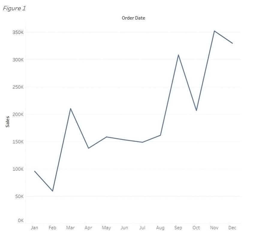
Once the data is imported and data visualizations are shown, this is when everything comes together, and users can explore their own data. Exploration provides answers that are easily digestible. It can be as simple as showing trending as Figure 1 does.
What Time of the Year Do We Have the Most Sales?


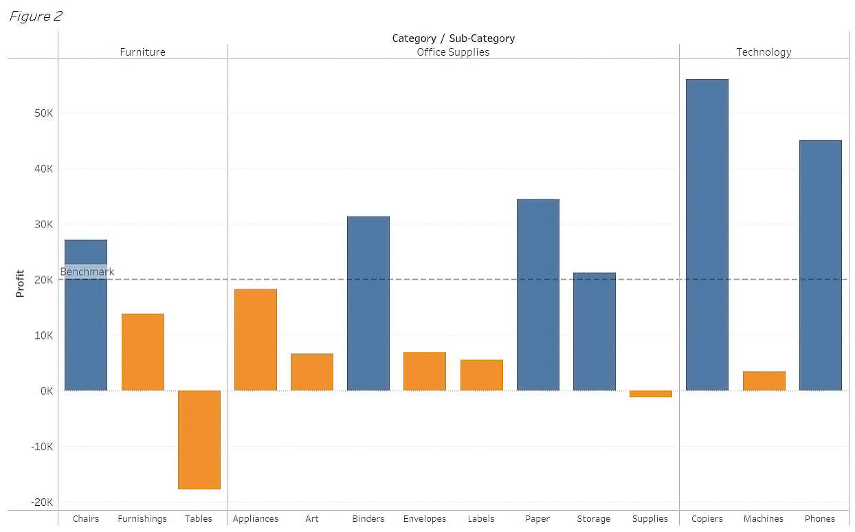
Other times, the data can present new, insightful questions. For example, we can easily tell from the product categories in Figure 2 that the orange subcategories did not meet the benchmark, especially the Tables subcategory. Why are the Tables profits so much lower than the others around it? Without the data visualization, noticing the patterns would have been a lot harder to see and digest.
What Product Categories Didn’t Meet the Benchmark?


Share Instant Information
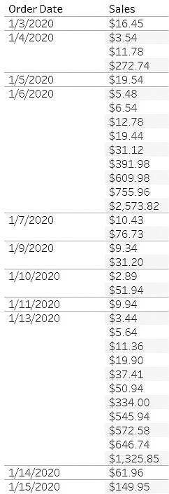
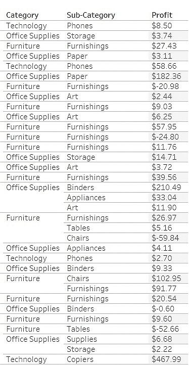
Because we naturally notice trends and outliers, the questions above should be much easier to answer with the visualizations rather than with the raw data. Being able to share data in real time can allow for faster data-driven decisions.
Going Forward
The positive implications of this are clear. Having data accessible can provide everyone the same context regardless of their expertise, helping make it easier to use that information to explore insights and share with other colleagues.
The better you can convey your points visually … the better you can leverage that information.” – Tableau1
If you have questions or need assistance, please reach out to a professional at Forvis Mazars or use the Contact Us form below.
- 1“What Is Data Visualization? Definition, Examples, And Learning Resources,” tableau.com
